How to Create a Business Plan Cover Page
We’ve all heard the adage that you shouldn’t judge a book by its cover. However, the truth is that people DO judge books by their covers – especially busy investors with stacks of unsolicited business plans on their desks.
These investors want an easy way to decide which business plans to pay attention to and which ones to ignore; often, a quick glance at the cover is enough to make up one’s mind. Here are the things to consider when you create your business plan’s cover page (and you can see an example toward the bottom of this post).
Contents
Information to Include on Your Business Plan Cover Page
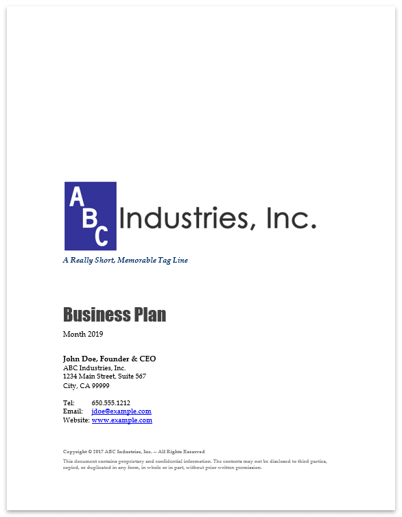
We recommend including only the essentials so that your reader can quickly scan and absorb the information. Here are the elements we typically include on a business plan’s cover:
- The company logo.
- A short, memorable tagline that reveals what kind of business is described in the plan.
- The words “Business Plan” so that it is clear what kind of document this is.
- The current month and year.
- The name and title of the company’s primary contact for investors (usually the founder/CEO).
- The company name and mailing address.
- Contact information that will allow an investor to reach you quickly and easily, such as a phone number, email address, website, twitter handle, etc.
- A copyright notice and a one- or two-sentence confidentiality statement.
Design Considerations for Your Business Plan Cover Page
Your design should be clean and professional:
- In general, we recommend the “less is more” approach, so you should avoid cluttering the cover with a slew of photos or other graphics.
- Be consistent with alignment. Unless you have an excellent reason for mixing up your alignment, don’t. For example, if you choose to left-justify some things, then left-justify all elements on your business plan’s cover page.
- Don’t use more than two fonts. I like a sans-serif font (think Arial) for the largest text and a serif font (think Times New Roman) for everything else, but that’s a matter of personal taste.
- Keep your color scheme very simple. If you use more than one color (aside from black), use a color scheme generator to select colors that go well together. Alternatively, consider sticking with only the colors in your logo if you already have one designed.
- If you choose to use an image, try putting it in the top 40% of the page, leaving enough room so that the other information doesn’t look cluttered. Also, the image should “bleed” to the edges of the page (this looks great in PDF format but will leave a white border if you print a hard copy).
You’ll most likely be distributing your plan in multiple formats – probably as a PDF file and in hard copy. Make sure the graphics look great in every format you use. If your logo looks pixelated, you should get a higher resolution image from your logo designer. The latest versions of Microsoft Office products — Word, Excel, and PowerPoint — have a “Save as Adobe PDF” option.
Here’s an example of a simple, straight-forward design we often use:
Final Thoughts About Your Business Plan’s Cover Page
Be sure to proofread everything carefully. A typo on your cover page won’t make a great first impression!
Finally, remember that these aren’t rigid rules. In fact, some of our consultants have personal styles that vary greatly from the advice provided above, as you can see in the business plan examples shown on our website. However, we all do our best to ensure that our cover pages look neat and professional so that they stand out from the crowd and have a better chance of being read. In the end, that’s the most important outcome.

